 This is the second article in my current series on my new car – a Mazda 3 SP25. Since the original article released in July, I have since expanded the series to a total of fire articles:
- New Car #1: Novated Leasing
- New Car #2: Fuel Efficiency (this article)
- New Car #3: Two Months In
- New Car #4: Good Bye Subaru Impreza
- New Car #5: GPS Navigation System Comparisons
Just this morning, the topic was broached at the breakfast table, and a simple high-level comparison was conducted to understand the fuel savings that I am beginning to appreciate, now that the car is some 18 days old, and I have filled up the tank for the first time using the fuel card system.
A quick disclaimer – I have a very limited understanding of car technical details, so this article is being written from a lay user’s perspective, and the focus is accordingly at the non-technical aspects of vehicle fuel efficiency. The basis for the detail later on is my logbook app which I have maintained for many years now.
Part of the motivation for selecting the Mazda 3 as my next car is reflected in the various reports that have touted its improved fuel efficiency – this one written up on caradvice.com: Mazda 3 to be 30% more fuel-efficient, offer advanced safety tech. The simple comparison done at the breakfast was based on the size of the fuel tanks – my previous car, a Subaru Impreza RS, has a fuel tank capacity of 60L. In contrast, the Mazda 3 is a smaller 51L, and thus every full tank of petrol that I purchase automatically is 9L less. Based on my driving habits, I tend to fill up a full tank every 15 days, or 26 times a year. Assuming this frequency of refueling remains constant with the new car, that’s a savings of 360L of petrol annually. Here in Melbourne, Australia, today’s average unleaded fuel price according to the RACV website, is $1.495 per litre. Applying this to the 360L and that’s slightly over $538 savings!
The big factor which contributes to this savings, is that the Subaru Impreza is an all-wheel-drive (AWD) manual transmission, whereas the Mazda 3 is a front-wheel automatic. It is to be expected that a key difference between these two types of drive transmissions will be seen in the fuel efficiency ratings. Further, the second big factor that makes comparisons of the two vehicles somewhat biased is the number of gears and the gear ratios that they govern. The Subaru, has five gears whereas the Mazda has six. In simple terms, the more gears a vehicle has, the smoother the driving experience can be, with each speed aligning more closely to an optimal gear. Just think of it from a bicycle riding experience – when you change gears, there is an automatic change in the amount of effort required to pedal.
My dad has been driving the Subaru Impreza in recent days whilst we still have it, and he was reminded that when he first bought it in 2005, the fuel consumption is a reflection of the gear ratios designed into the vehicle. The Subaru The approach to our home from the main road has an up-hill gradient, and this is a popular and easy test of vehicles and their gear ratios. The Subaru will accelerate up the hillside but either at a high second gear or low third gear – the speed is in between such that neither gear is optimal. So, even when taking the difference in driving styles – my Dad versus myself – the Subaru is inherently designed to consume more fuel. After all, the Subaru Impreza is a wanna-be WRX, so the sporty-ness feel is engineered intentionally.
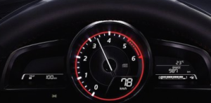
The dashboard of the Mazda 3, as seen in the top image, reflects the current generation/standard of providing metrics/counters on the right, allowing the driver to gain a real-time understanding of their car:
- Current fuel efficiency
- Overall fuel efficiency
- Range
- Cruise control speeds
- Cruise control fuel efficiency
I personally find the range metric invaluable and I use that, in conjunction with the actual fuel gauge to determine when to fill in with petrol. Previously, my driving behaviour in the Subaru was determined by the fuel gauge and odometer trip readings, whereby a 500km trip distance was for me the trigger to go and fill up with petrol. The range metric available to me now is an inverted reverse approach to my previous behaviour, and it is taking me a little time to adjust and no longer have 500km as the trigger.
The table below is exported out of the app Logbook, which I have found very useful over the 5 years that I have consistently been using it to track fuel purchases, and also the periodic car maintenance. The beauty of WordPress with the EasyTable plugin allows me to simply upload the file to XBOP and present it as is below. It also provides an interesting historical view of fuel prices over the period. Logbook itself calculates the Efficiency metric, and I added on the Days and KM/Day columns to the end as some basic analysis. Before launching into the detail, I will provide the summary average metrics and notes first:
- 113 log entries, with two missing from the month of May 2014
- Average fuel price is $1.35/L
- Average fuel efficiency is 9.96L (per 100km)
- Average tank of fuel lasts 15.3 days
- Average amount of fuel purchased each time is 47.07L
- Average cost of fuel purchase on average is $63
- Average distance driven per day is 33km
The following graphs were produced via Excel, split into groupings which make for easier comparison.
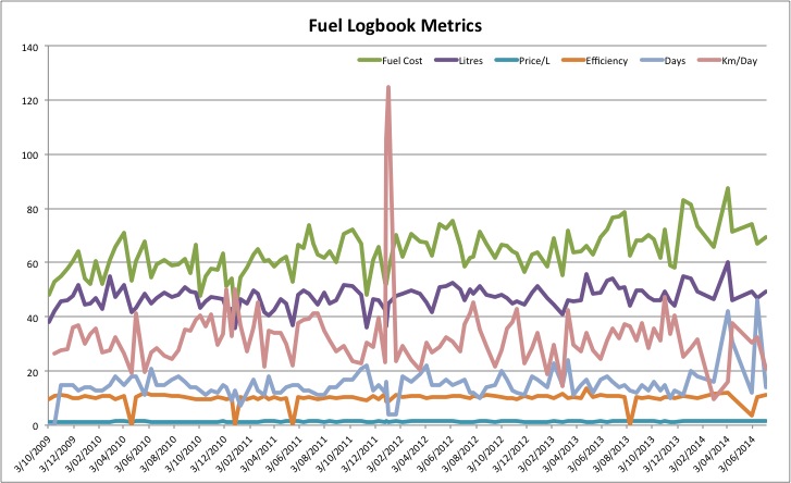 The clear upward trend in the fuel cost/price is not as alarming and reflects the tempering of fuel prices in recent times. The one exception in early 2014, where 60 litres of fuel was purchased reflects the one incident where I completely ran out of fuel… The days/duration metric is also slightly out for 2014, where I spent an entire month on holiday – the only extended holiday in the timeframes covered by this data set! The clear relationship between fuel cost and litres is the price – the bottom line which is pretty meaningless in this overall graph.
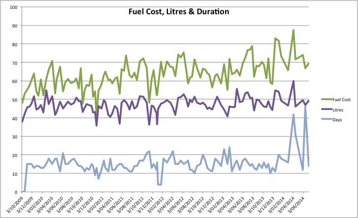
This second graph helps to make clearer the rising cost of fuel. Across the board, my fuel purchasing habits and frequency is steady, within a range of 2-3 weeks, spending a similar amount of money on a similar amount of fuel. The data for 2014 after April is distorted because of the missing month of May data…
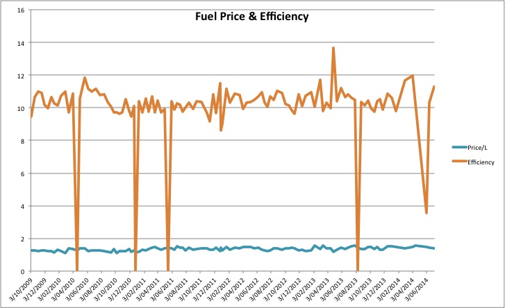
A brief analysis of the fuel price and efficiency graph above first requires us to ignore the four/five efficiency points where the data is simply not available. June 2013 has one spiking of efficiency. A slight trend was emerging towards the end of 2013 and throughout 2014.
This dataset is exclusively for the Subaru Impreza. Whilst my Dad continues to drive it, I have agreed to continue logging it via these tools for analysis. Naturally, the daily distances driven will decrease dramatically, and the time between refuelling will lengthen.
Part three of this series will thus not become available until the final logs are recorded for the Subaru. Planning ahead, part four of this series will likely be scheduled for December 2014, to allow for a six month period of data to be logged.

1 comment
Comments are closed.