Over the weekend, as part of attempting to release a second photo gallery on XBOP, I realised that my WordPress theme needed to be upgraded in order to take advantage of a key feature relevant for the implementation of my photo galleries.
The initial release of the Burke Road level crossing photo album worked, but I since attempting to replicate this model for Brickvention 2016, the gallery seems to have become somewhat unstable. Potentially the technology is struggling to cope with the influx of some 500+ photos but ever since I uploaded my latest event photos/videos overnight of Saturday 16 – Sunday 17, both photo galleries have stopped working…
Therefore, this latest version update to XBOP is a critical and live update. Steps taken so far include:
- Upgrading my WordPress theme to Catch Box Pro
- Selectively changing the layout template for the photo gallery pages to full-page width (without any sidebars)
- Tweaking the settings of Easy Media Gallery Pro (v1.5.1.5):
In this last update, the documentation was extremely helpful and for now, the smaller photo gallery is back working.
The upgrade of the WordPress theme may have created a brief period of visible change on the website, but those differences should have been resolved by now. Catch Box Pro offers a number of more advanced features, some of which I had visibility of when utilising the free edition, but only now having upgraded, do I more fully appreciate the differences. In a nutshell, the Pro edition offers:
- advanced theme options
- responsive design
- featured post slider
- featured page slider
- featured image slider
- webmaster tools
- custom widgets
- dedicated support
Whilst use of WordPress over the years has provided a level of convenience in terms of the what-you-see-is-what-you-get (WYSIWYG) user interface, some tweaks require an appreciation of HTML/PHP coding. For both versions 3.1 and 3.2 of XBOP enhancements, I delved under the hood of WordPress to make minor adjustments. With the aid of great tools that come in-built with our modern-day web browser, it is quite easy to track down HTML elements and work out how to manually adjust default/hard-coded color schemes. By default, the theme provided Featured Content Slider comes with a dark background and white text – whereas I prefer a cleaner, more integrated look and feel of the Featured Content Slider. Thus, I had to manually swap out the color designations prescribed in the CSS stylesheet.
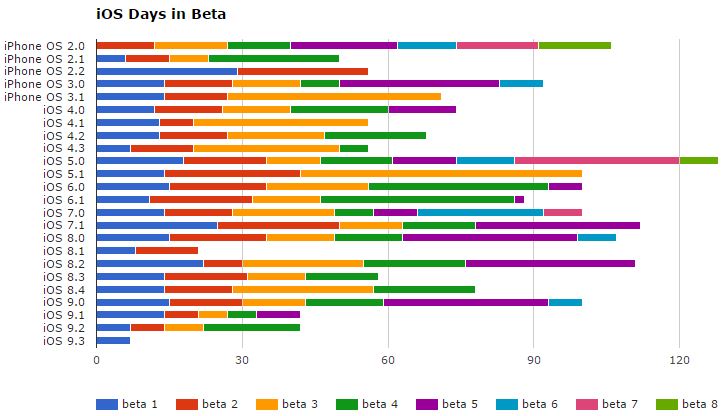
The need for this update (version 3.2), so soon after the previous iteration reminded me of this graphic, found at ThinkyBits. At the source website/blog, hovering the mouse over each coloured bar leads to additional information popping up. That blog also explains that the technology behind this nifty feature is actually Google Charts.

Thus, I have also decided to implement my own equivalent and add it to the Version History page. My implementation of this stacked bar chart required the adoption of a Google Chart WordPress plugin where the syntax was slightly different to the method used at ThinkyBits, but the end outcome, in particular with the interactive mouse hover is particularly satisfying. As part of ensuring a clear depiction of the graph, the selected use of a full-width page is adopted; selected use of this template is generally restricted to photo galleries and content that utilises tables which would benefit from the additional page real estate.

You must be logged in to post a comment.